
The Overview tab is the financial dashboard of a project. It gives you an at-a-glance summary of the project's financial health - combining cost and revenue summaries, a planned vs. actual chart, upcoming planned data, and a set of performance indicators - all in one place.
To access the Overview Panel, open a project from the Projects panel and click the Overview tab in the top menu.
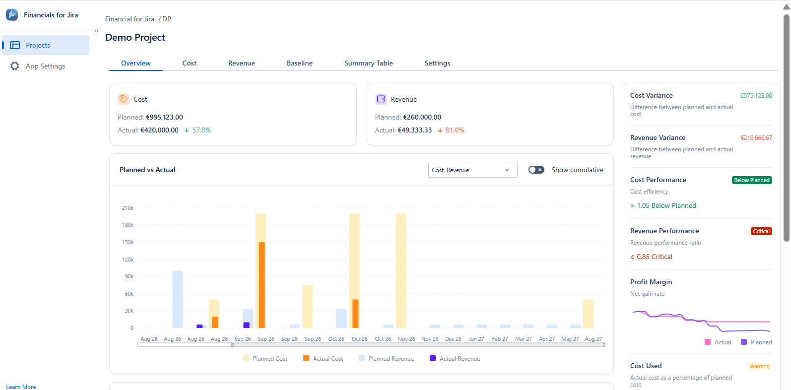
The Overview panel includes the following:
-
Cost and Revenue summary cards
-
Planned vs. Actual chart
-
Upcoming Planned Data
-
Performance indicators
8.1 Cost and Revenue summary cards
At the top of the Overview tab, two summary cards display the high-level financial position of the project:
|
Card |
What it shows |
|---|---|
|
Cost |
Total planned and actual project costs, with the percentage of the planned budget remaining. If actual costs reach or exceed the planned target, the percentage appears in red. |
|
Revenue |
Total planned and actual project revenue, shown as the percentage that actual revenue falls short of the planned target. If actual revenue meets or exceeds the planned target, the percentage appears in green. |
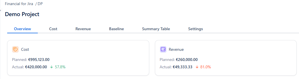
These totals aggregate all plans and actuals across the entire project — not just a single date range.
8.2 Planned vs. Actual chart
The Planned vs. Actual chart visualises planned and actual cost and revenue over time as a bar chart. Each bar group represents a time period, with separate bars for Planned Cost, Actual Cost, Planned Revenue, and Actual Revenue.
Chart controls:
|
Control |
Description |
|---|---|
|
Filter dropdown |
Filter the chart to show Cost, Revenue, or both (Cost, Revenue). |
|
Show cumulative toggle |
When enabled, the chart displays running totals over time instead of period-by-period values. This makes it easier to see the overall trajectory of planned vs. actual figures across the project timeline. |
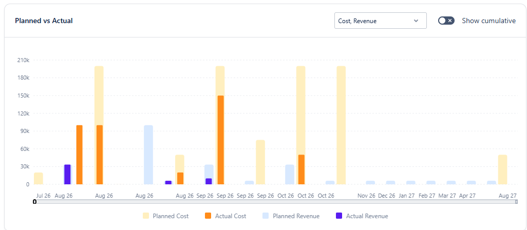
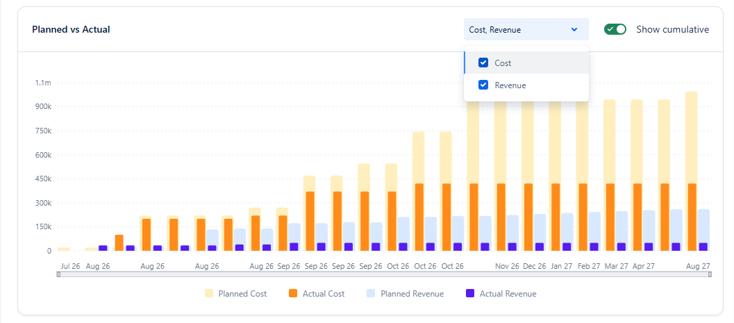
Use the Show cumulative toggle when you want to understand the overall financial trajectory of the project rather than individual period spikes. Cumulative view is especially useful for long-running projects where you need to see whether actuals are tracking ahead of or behind the plan over time.
8.3 Upcoming Planned Data
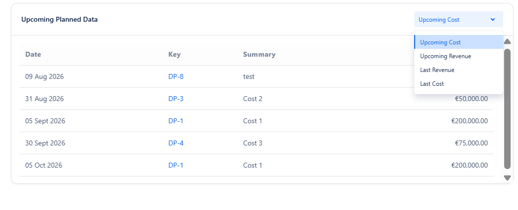
The Upcoming Planned Data table lists the next scheduled plans - sorted by date - so you can see what financial commitments are coming up.
Filter options:
Use the dropdown in the top-right corner of the table to switch between:
|
Option |
What it shows |
|---|---|
|
Upcoming Cost |
Future planned cost entries, sorted by date ascending. |
|
Upcoming Revenue |
Future planned revenue entries, sorted by date ascending. |
|
Last Cost |
Costs incurred most recently, with the latest entries shown first. This option includes actual costs recorded before today. |
|
Last Revenue |
Revenues generated most recently, with the latest entries first. This option includes actual revenues recorded before today. |
8.4 Performance indicators
The right-hand panel of the Overview tab displays a set of financial performance indicators. Each indicator provides a specific metric about the project's financial health.
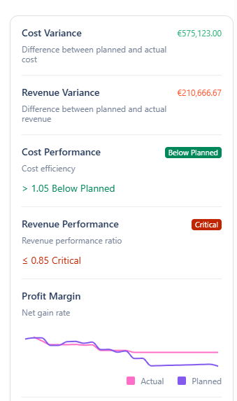
Cost Variance
The difference between total planned cost and total actual cost.
If actual costs are lower than planned (under budget), it displays in green. If actual costs exceed the plan (over budget), it displays in red.
Revenue Variance
The difference between total planned revenue and total actual revenue.
If actual revenue exceeds the plan (over target), it displays in green. If actual revenue falls short of the plan (under target), it displays in red.
Variances are shown as absolute values. Positive and negative cases use green and red to indicate direction.
Cost Performance
Definition: Cost efficiency ratio - how actual cost compares to planned cost.
|
Label |
Decision Rule |
Meaning |
|---|---|---|
|
On Track |
0.95 ≤ plan/actual ≤ 1.05 |
Actual costs align with the plan. |
|
Below Planned |
plan/actual > 1.05 |
Actual costs are below plan. |
|
Warning |
0.85 < plan/actual < 0.95 |
Actual costs slightly exceed plan and should be reviewed. |
|
Critical |
plan/actual ≤ 0.85 |
Actual costs have significantly exceeded plan. |
Revenue Performance
Definition: Revenue performance ratio - how actual revenue compares to planned revenue.
|
Label |
Decision Rule |
Meaning |
|---|---|---|
|
On Track |
0.95 ≤ actual/plan ≤ 1.05 |
Actual revenue is in line with plan. |
|
Over Planned |
actual/plan > 1.05 |
Actual revenue exceeds plan. |
|
Warning |
0.85 < actual/plan < 0.95 |
Actual revenue is slightly below plan and should be reviewed. |
|
Critical |
actual/plan ≤ 0.85 |
Actual revenue is well below plan. |
Profit Margin
Definition: Net gain rate - the relationship between actual and planned profit over time, displayed as a line chart.
The chart shows two lines: Actual (pink) and Planned (purple). When the actual line trends below the planned line, the project's profit margin is declining relative to expectations.
Cost Used
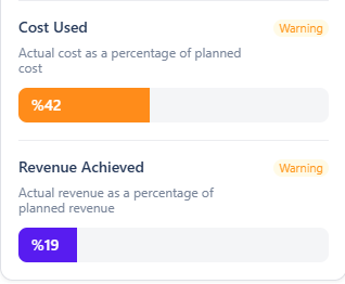
Definition: Actual cost as a percentage of planned cost, displayed as a progress bar.
Revenue Achieved
Definition: Actual revenue as a percentage of planned revenue, displayed as a progress bar.
The Cost Used and Revenue Achieved show a "Warning" status to remind the user to check them throughout the project.
Progress of Plans
Definition: A donut chart showing the distribution of planned entries by their completion state.
Use the dropdown to switch between Cost and Revenue.
|
Segment |
Colour |
Meaning |
|---|---|---|
|
Completed |
Green |
Plans whose associated actuals have been fully recorded. |
|
Overdue |
Red |
Plans with a scheduled date in the past that lack associated actual records. |
|
Upcoming |
Grey |
Plans scheduled for a future date. |
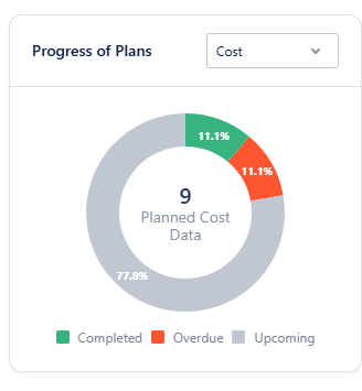
The Plan Progress chart is a key indicator on the Overview tab. A large "Overdue" section shows past plans with missing or incomplete actual data; review these and update or add the actual data.